
This is a pretty good book, if you like Friends. It has interviews, photos, lots of inside details. But naturally, we’re not here to talk about that. We’re not like normal people.
We’re here to nitpick.
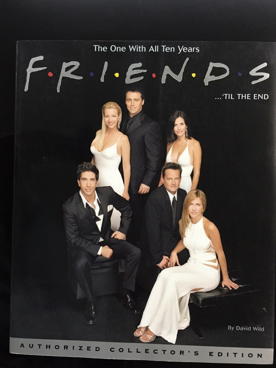
Every book has language errors. No copyeditor is perfect, and mistakes will always slip through. I get that. But the book cover has only a handful of words, and it’s the first thing the reader sees, so it really should be flawless.
This cover has not one but two language problems. The first is an outright error. The second, while not strictly incorrect, is very misguided.
Can you figure out what they are?
Click the image for a larger view.


Traditionally, the ‘with’ in the tag line would be lower case.
Unless it is either a very limited run or David Wild takes an eponym, collectors is plural, so the comma is in the wrong place.
Listing a book as ‘by’ is not standard
You raise some good points. Let’s look at each.
The capitalized “With” caught my eye too, but it’s actually a matter of style, and style guides aren’t consistent about which words to capitalize in so-called title case. The Chicago Manual of Style, for instance, would lower-case it, whereas several other guides would capitalize it. As a copyeditor, I would of course follow whatever style guide I was given, but I don’t think this is a priori incorrect.
I think the apostrophe in “Collector’s Edition” can, likewise, go either way. I see your point – there are multiple collectors, so logically the apostrophe should go after – and AP Style agrees with you in its entry for the analogous term “collectors’ item.” However, Webster’s Third New International Dictionary sides with the Friends cover: “collector’s item.” A quick search online reveals professional publications using both versions frequently. So I wouldn’t call this one a problem either.
I do agree that “by” is nonstandard for a cover, and should be removed. As it happens, though, that isn’t one of the two things I noticed.
So, still two to go…
I was going to say ’til should be till and Collector’s should be Collectors. Dave is right about “by” though it kind of makes sense for a book like this one.
Ding ding! ‘Til should be till, that’s one of the two I was thinking of. It’s not strictly speaking an error, because “until” is a word and “’til” is a valid contraction, but it’s rather silly when “till” is perfectly valid and even older than “until.”
Collector’s, Collectors’, Collectors, I think all three could be correct, depending on precisely what you mean. Collector’s Edition: an edition that the collector (in general) will want; Collectors’ Edition: an edition that collectors will want; Collectors Edition: an edition for collectors.
There’s one other problem that nobody has mentioned. It’s very minor, but it’s also indisputably an error.
Let’s go a little off the reservation for guesses.
– One error is of course the periods or dots between letters in the word Friends. It’s a logo, but if we’re talking words only, it’s wrong. When you see a word like M*A*S*H with ‘*’ in between each, that’s an acronym whereas F*r*i*e*n*d*s stands for nothing.
– The construction Friends … ’til the end is a little weird. Most people would just say “Friends till the end” without the …
– I have a feeling there’s something technically “wrong” with “One With All” or “All Ten Years” but I don’t see it. Even if it is wrong, it’s within the accepted conventions of episode titles.
Interesting point about the Friends logo. But I’d argue that the dots are probably decorative and not meant to be punctuation. In any case, the logo was well-established by the time this book came out, so it would’ve looked odd to have the letters without it.
I agree that the “…” feels a bit off, but I think it’s probably valid.
I think you’re correct that the phrases “One With All” and “All Ten Years” are both fine, and that they match the episode naming convention.
As I’ve mentioned, the error I’m thinking about is very minor (although it is definitely and indisputably an error). So don’t let it drive you too crazy if you don’t see it. 🙂
‘Y’ is lowercase?
I think it’s an uppercase ‘Y’ that looks sorta like a lowercase in that font. Not 100% sure. That is odd, though.
I was thinking of something else, however.
Is the ‘ mark before til the wrong way?
Nailed it! 🙂 The mark before “til” should be an apostrophe, but they have it as a left single quote. THE HORROR!